Skip to content
Varun Prasad

DESIGN SYSTEM · UI

Pronto Visual System

The colour, type scale, grid, tokens and component library behind Pronto's enterprise SaaS platform, aligned with engineering teams across 30+ countries.

Client
Havas · Pronto
Role
Lead Designer
Deliverables
Colour, type scale, grid, tokens, component library
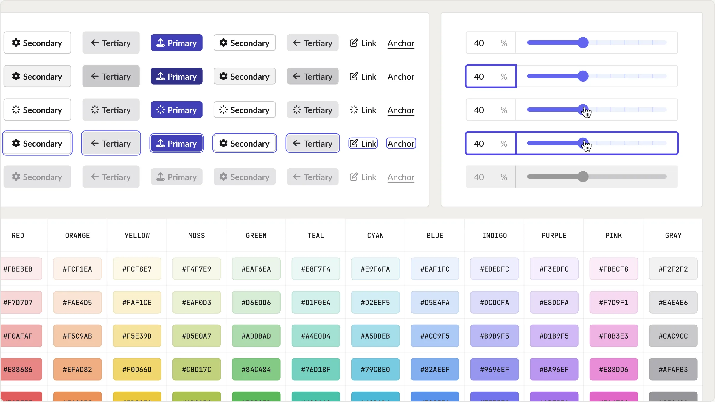
Pronto design system overview showing tokens and components
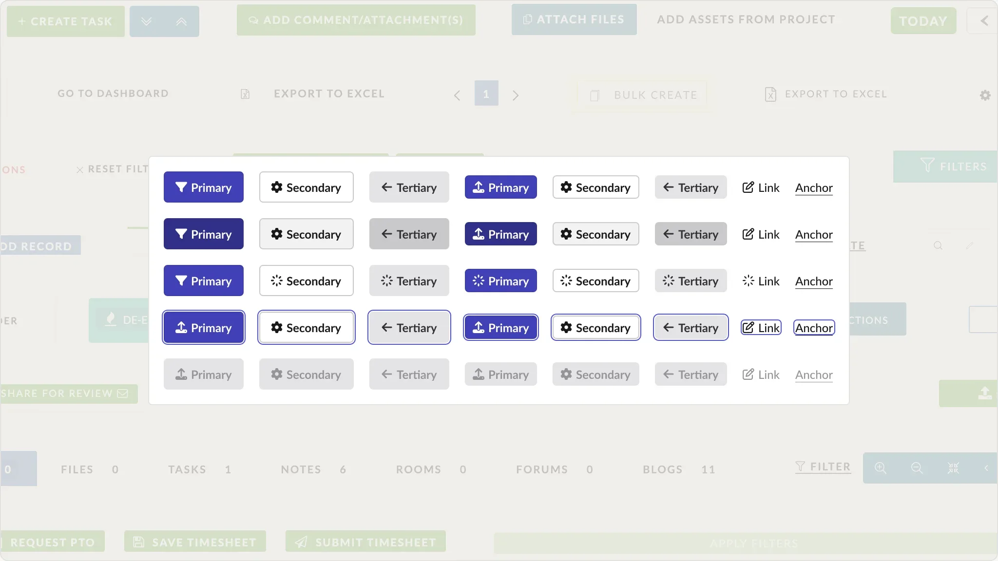
The five consolidated button variants in every state
Five levels of emphasis, primary through anchor.
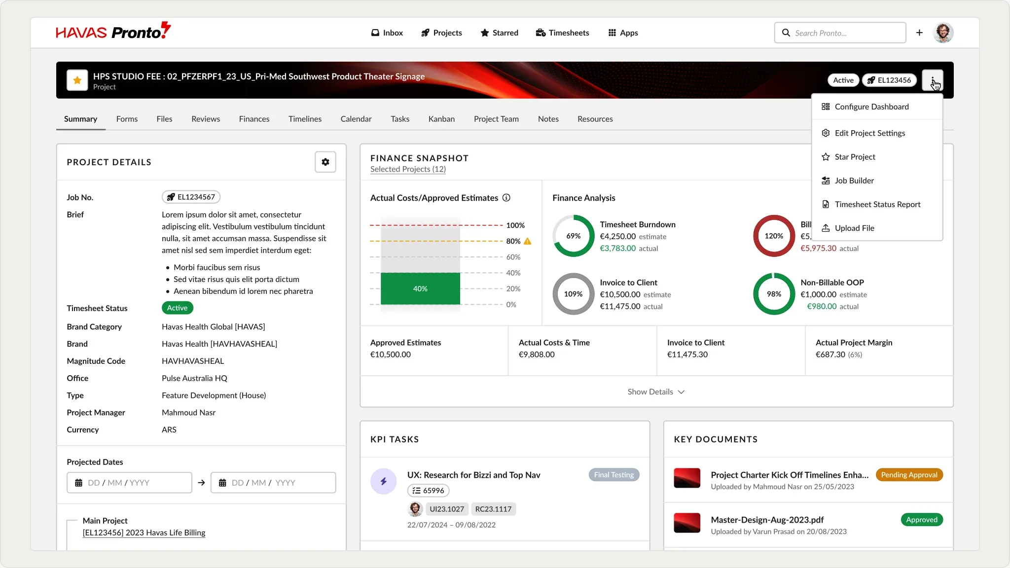
Pronto Project Wizard summary view built from published components
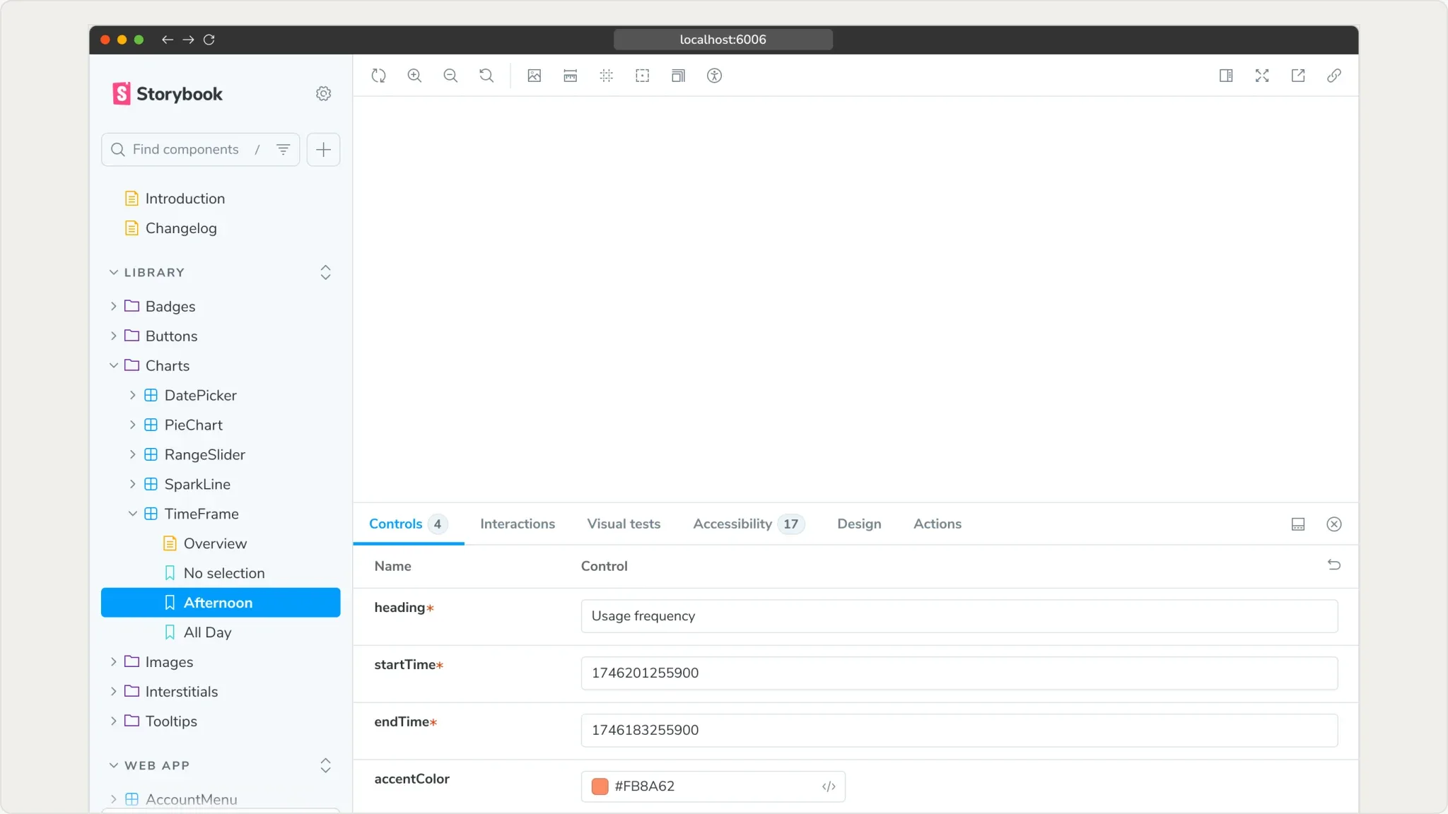
Storybook implementation of the token-based component library
Storybook implementation.
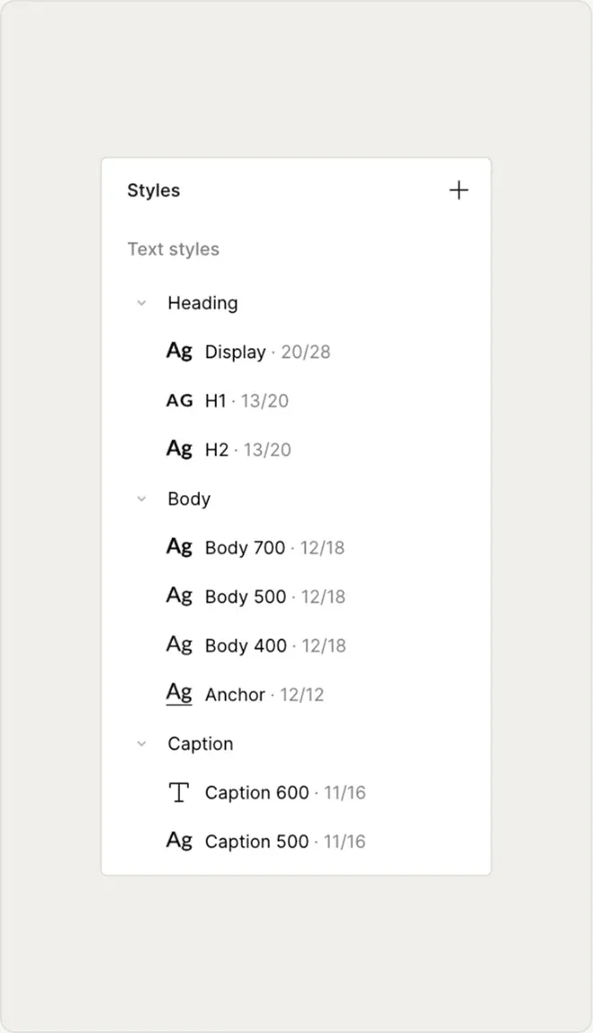
Text styles panel showing the single type scale
One type scale for hierarchy.
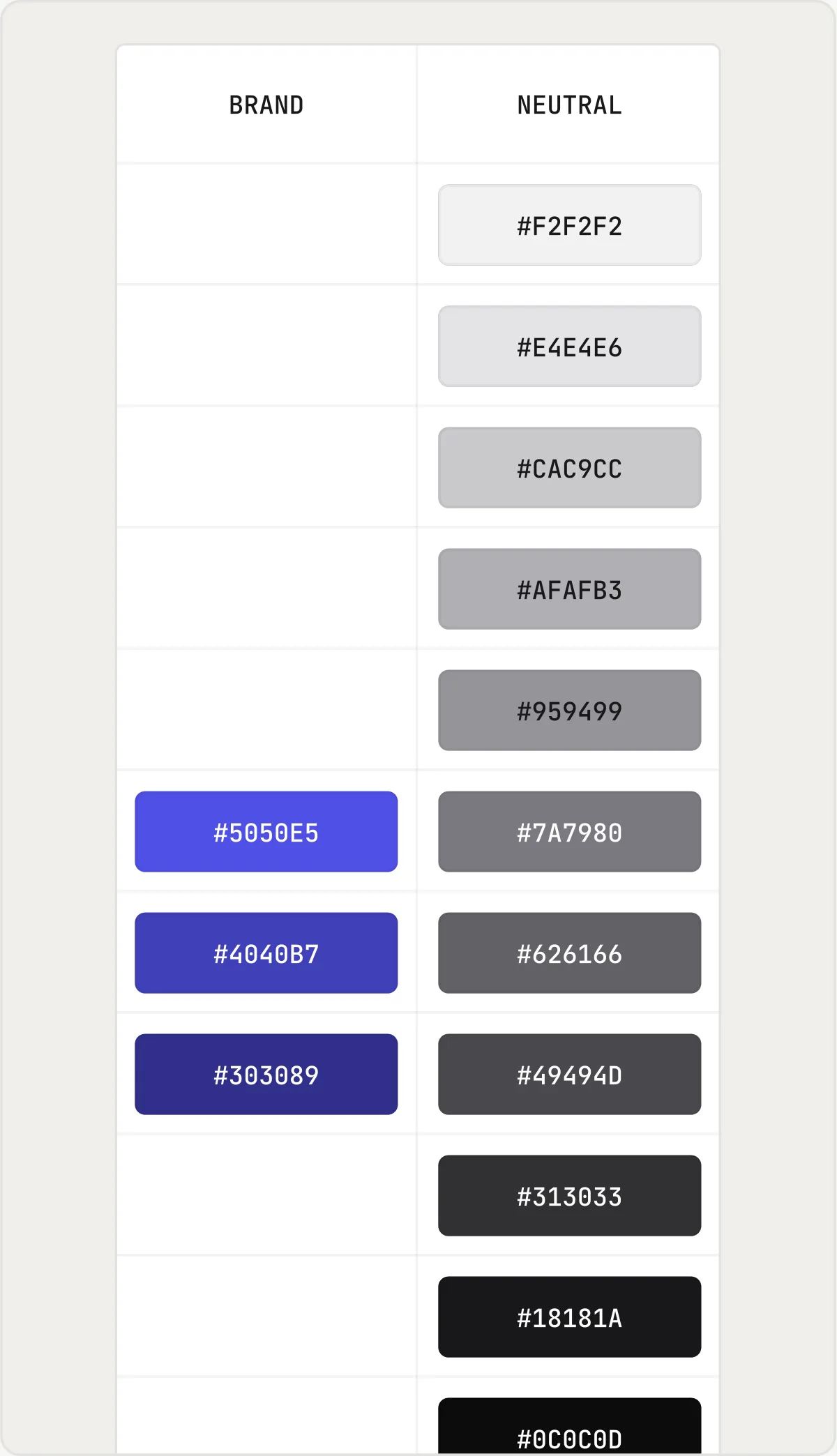
Brand and neutral colour swatches with hex values
Eight neutral steps, three brand steps.
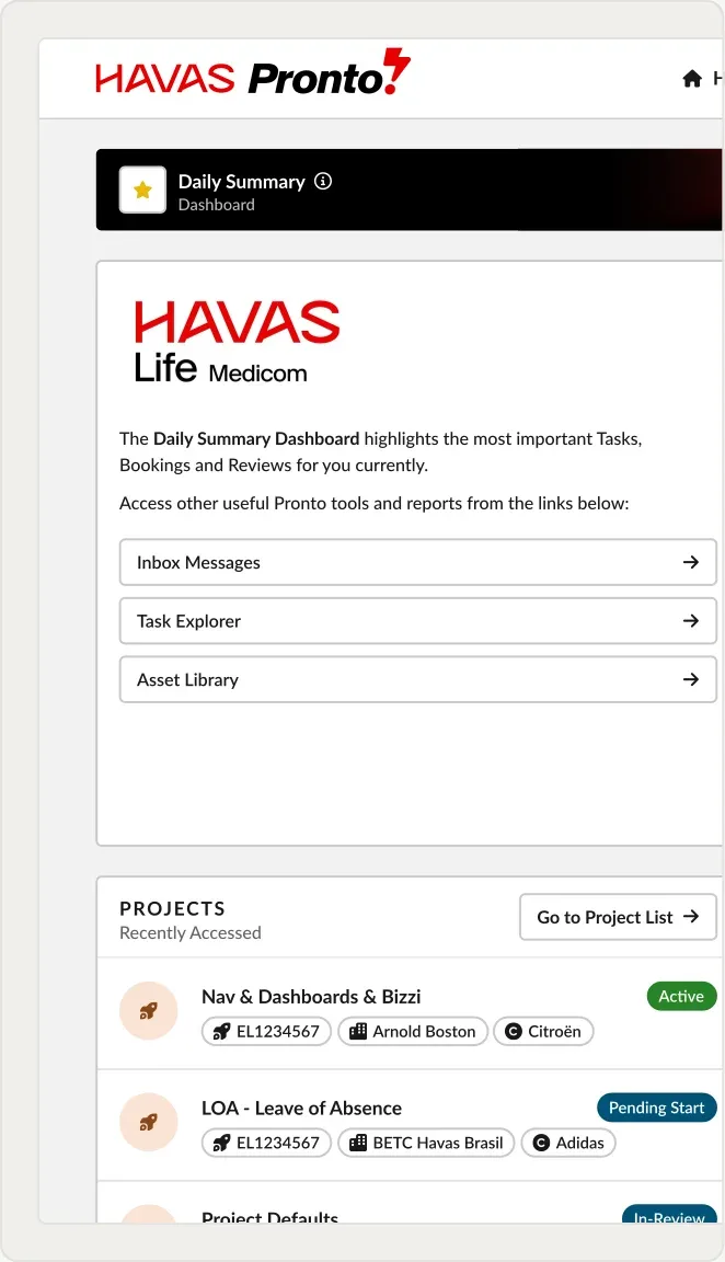
A Pronto dashboard screen built with the space, radius and stroke tokens
Space, radius, stroke and control tokens.
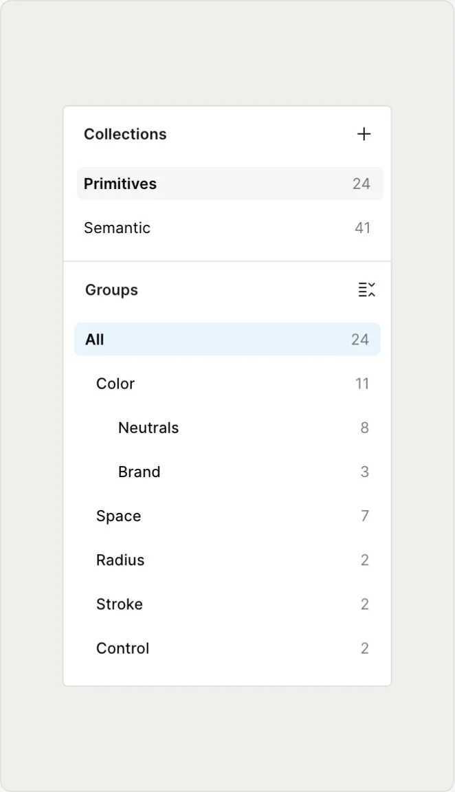
Figma Variables panel split into Primitives and Semantics
Primitives and semantics.
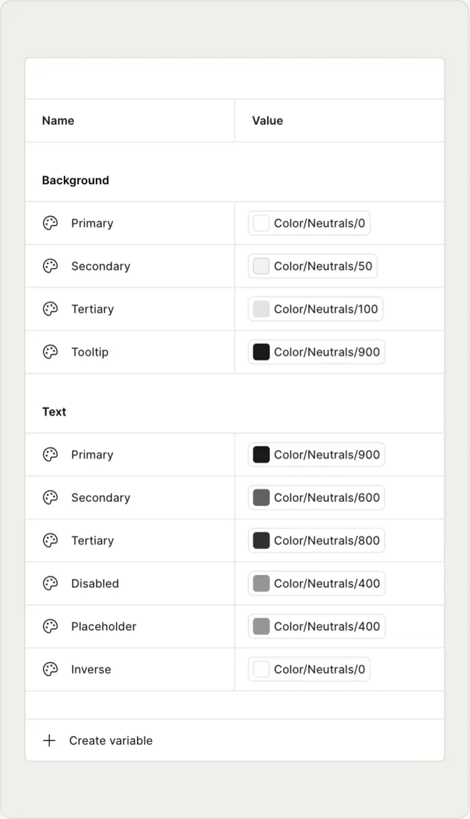
Semantic variables each pointing at a primitive colour value
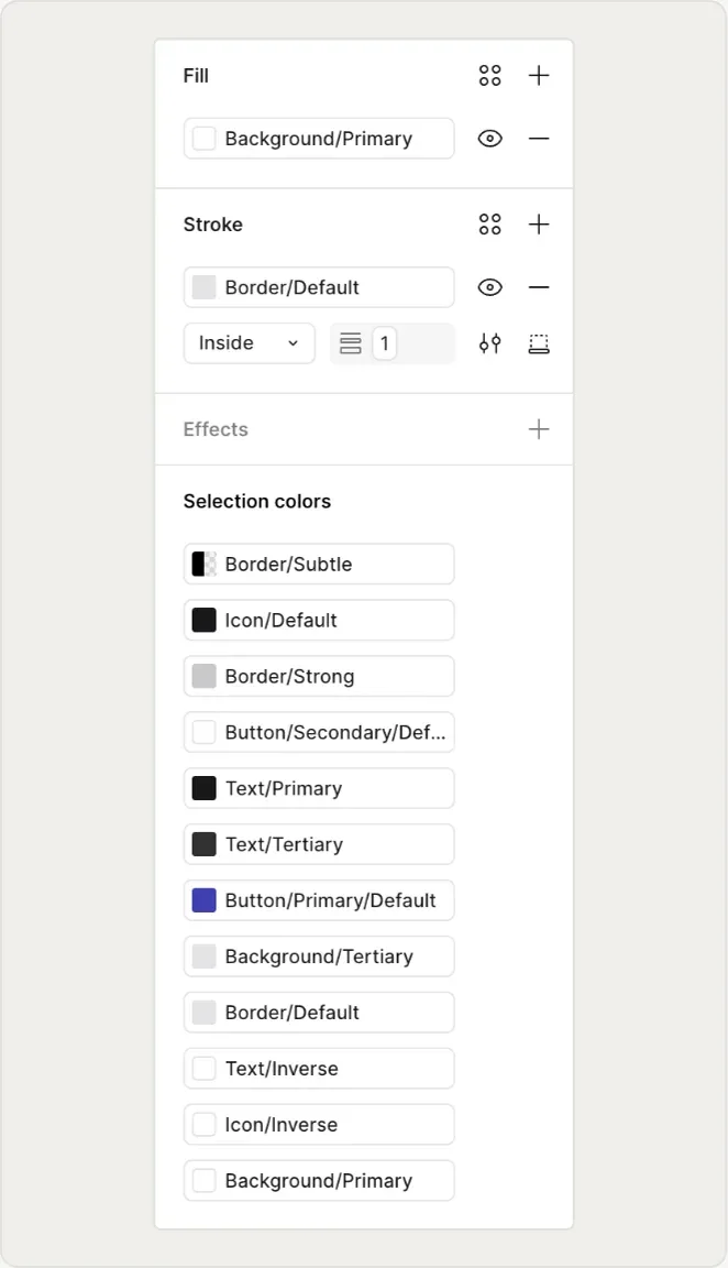
Selection colours panel listing semantic tokens on a component